
Announcing Blazorise 1.2
We are excited to announce the release of Blazorise v1.2, which brings a number of new features, improvements, and bug fixes to the framework. This release marks a significant milestone for Blazorise and we are confident that it will provide an even better experience for our users.
Some of the highlights of this release include the addition of a new Tailwind CSS provider, improved DataGrid UI, and an introduction of several new extension components. We have also made a number of other updates and enhancements to the framework to improve stability and reliability.
We hope you enjoy this new release and we can't wait to see what you build with it!
Blazorise 1.2 Highlights 💡
- New Tailwind CSS provider.
- New Chart DataLabels component.
- New LottieAnimation component.
- New Cropper component.
- New Groupable feature in DataGrid.
- Improvements on TreeView.
- Improvements on Autocomplete.
- New Licensing System.
Upgrade an existing Blazorise project 👨🔧
To upgrade an existing Blazorise applications from 1.1.x to 1.2:
- Update all Blazorise.* package references to 1.2.
You should now be able to use Blazorise without any breaking changes.
New Features 🚀
Tailwind CSS Provider Markdig.Syntax.Inlines.HtmlInline
As part of our ongoing efforts to improve and enhance the functionality of Blazorise, we are excited to announce the release of a new Tailwind CSS provider for Blazorise, which was created on top of Flowbite with the courtesy of their creators.
For those unfamiliar with Tailwind CSS, it is a utility-first CSS framework that allows developers to easily style their applications by providing a wide range of pre-designed classes that can be applied directly to HTML elements. It is a popular choice for many developers because of its simplicity and flexibility.
With the new Tailwind CSS provider for Blazorise, you can easily apply Tailwind styles to your Blazor components and take advantage of all the benefits that Tailwind has to offer. This provider is fully integrated with Blazorise and allows you to use all the features of Blazorise while still benefiting from the power of Tailwind.
To get started with the new Tailwind CSS provider, simply install the latest version of Blazorise and add the Tailwind CSS provider to your project by following our startup guide.
We would like to extend a special thank you to the creators of Flowbite for their contribution in making this provider possible.
We hope you enjoy this new feature and we can't wait to see what you build with it!
Chart DataLabels
The Chart DataLabels is a new feature that provides users with the ability to display data values for each data point in a chart. The Blazorise Chart DataLabels can be customized to suit individual needs, with options for font size, color, and position, allowing for a high degree of flexibility and control. With this new feature, Blazorise charts are now even more powerful and easier to use.
The usage of new DataLabels component with examples can be see at DataLabels page.
LottieAnimation extension

The LottieAnimation component allows you to easily incorporate beautiful, customizable animations into your Blazor applications using the Lottie Javascript library. The library's purpose is to allow applications to directly render animations exported from Adobe After Effects without needing to recreate the animation by hand in the HTML. It is simple to use and provides a seamless integration with Blazorise.
We are grateful to smfields for their contribution to the Blazorise community and for bringing this exciting new feature to our users.
To get started with the LottieAnimation component simply folllow the guide on our LottieAnimation page.
QRCode Icon
It is now possible to add custom icons within the QRCode.
The usage of new icon can be see on QRCode page.
Cropper Component
When building an application, best practice requires reducing an image's surrounding noise and directing a user's attention to a specific part of the image. Image cropping is a method for manipulating images to remove any unwanted elements. By changing the aspect ratio or orientation, we can draw viewers' eyes to the photograph's primary subject and improve the overall composition. This applies to profile pictures or uploading images with specific dimensions.
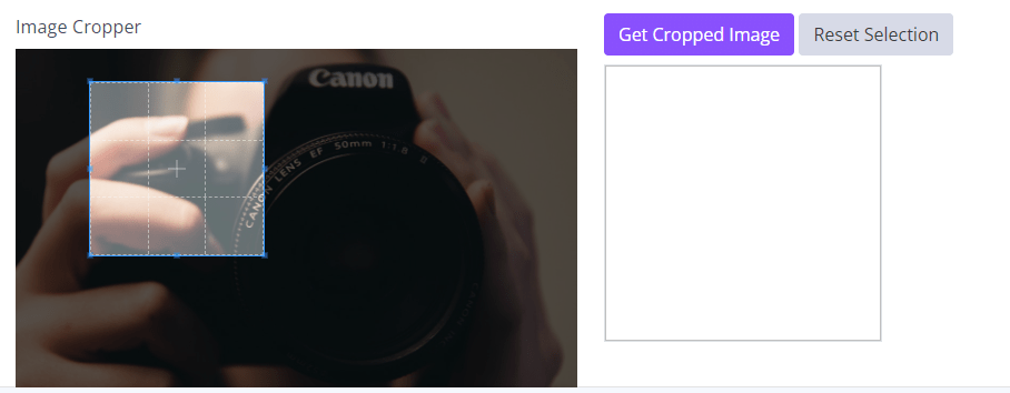
The new Cropper component handles all of that. You can now upload an image and then select part of it, rotate, scale, and crop it. You can also add a preview by adding a CropperViewer whenever on a page, and it will automatically synchronize with the latest selection.
As with many other components, the Cropper component is also created with the help of our community member njannink. We will need to send him a larger MVC award gift next year 😊.
The usage of new cropper component can be see on Cropper page.
Gap Utility
Blazorise Gap Utility is a new feature that provides users with the ability to create gaps between elements in a responsive and flexible manner. This utility allows developers to easily manage spacing between elements and to ensure consistency in their layouts. With the Blazorise Gap Utility, users can control the size and behavior of gaps between elements with ease, making it simple to create beautiful, responsive designs.
Typography Lead component
This component allows users to easily apply a larger, bolder font style to important text on their web pages, making it stand out and draw the reader's attention.
This new component can be used to wrap any text element, and includes customization options for font size, font weight, and text color.
AccordionToggle component
We have introduced a new AccordionToggle component that should be used instead of the Button component when building an Accordion.
The Button component is no longer recommended for use inside an Accordion and may cause unexpected behavior. Using the AccordionToggle component will ensure that your Accordion functions as intended.
To update your code, simply replace any instances of Button inside your Accordion with AccordionToggle.
TreeView improvements
The TreeView component now supports a multiple selection mode, which allows users to select multiple nodes at the same time. To enable this mode, set the SelectionMode property to Multiple. When this mode is enabled, each node in the TreeView will display a checkbox next to its label. Users can then select or deselect nodes by clicking on the checkboxes. The selected nodes can be accessed through the SelectedNodes property, which returns a list of the selected nodes. You can also use the SelectedNodesChanged event to be notified when the selection changes.
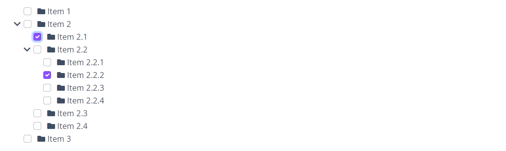
Several new APIs for the Blazorise TreeView component have also included in this release! These APIs include:
GetChildNodesAsync: allows you to retrieve the child nodes of a specific node asynchronously.HasChildNodesAsync: allows you to check if a specific node has child nodes asynchronously.ExpandAll: expands all nodes in the tree.CollapseAll: collapses all nodes in the tree.
In addition to these new APIs, we've also added a new feature called AutoExpandAll. This feature will automatically expand all nodes in the tree on the first load only.
We hope this new features will make it easier for users to work with the TreeView component.
Autocomplete improvements
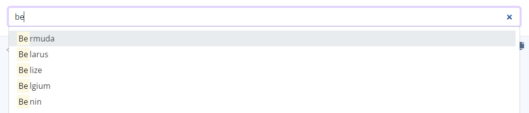
Highlight search
Blazorise Autocomplete now includes a search highlight feature that allows users to easily locate items in the dropdown list. When a search value is entered, the matching items in the dropdown will be highlighted, making it easier to find and select the desired item. This feature is particularly useful when working with large lists of items and helps improve the overall user experience.
Virtualize mode
The Virtualize feature allows for loading data on demand while scrolling, which greatly improves the performance of the component when working with large datasets.
With Virtualize, the Autocomplete component only loads the items that are currently visible in the list, and as the user scrolls, more items are loaded in the background. This allows for a much faster and smoother user experience, especially when working with large lists of items.
To use the Virtualize feature, simply set the Virtualize property to "true" on the Autocomplete component.
DataGrid
Grouping
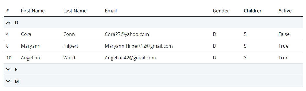
The new grouping feature for Blazorise DataGrid allows you to easily group and organize your data by specific columns. This can be useful for analyzing large sets of data and finding patterns or trends.
- The
GroupableandGroupingparameters allow you to specify which columns can be grouped and which should be used for grouping. You can also provide a customGroupByfunction to define how the data should be grouped. - The
ShowGroupingon DataGrid feature allows you to drag and drop groupable columns onto a designated group area, making it easy to rearrange and experiment with different groupings. This feature is helpful for creating ad-hoc analysis and reporting.
Overall, this new grouping feature provides more flexibility and control over how you organize and analyze your data within the Blazorise DataGrid.
The group feature can be seen on the DataGrid grouping page with various examples.
New PageSelectorTemplate & PageSizesTemplate
The new Blazorise DataGrid features include a PageSelectorTemplate and PageSizesTemplate. The PageSelectorTemplate allows users to customize the look and feel of the page selector, while the PageSizesTemplate allows users to customize the options for the number of items per page. These new templates provide increased flexibility and customization for the DataGrid, allowing developers to tailor the user experience to their specific needs.
Navigable
The new Navigable feature for Blazorise DataGrid allows you to navigate the grid by using the Arrow Up and Arrow Down Keys on your keyboard.
Utilities
We have also introduced various new APIs for controlling the text alignment, vertical alignment, flex, and gap utilities of DataGrid header, filter, and group cells. This will make it easier to customize the UI of the DataGrid.
New Licensing System
We are pleased to announce a new licensing system for Blazorise 1.2, designed to enhance the security of your Blazor applications. To begin using the new system, simply log in to your account on the Blazorise website and generate your unique Product Token. Once generated, you will need to define this token in your Blazor application during startup.
Please be advised that, at present, the ability to generate the product token is only available to our commercial users. However, we are working diligently to make this feature accessible to all users in the near future.
We want to assure you that the new licensing system will have no impact on the features and functionality of Blazorise. The only difference you may notice is a "free license message" printed in the console.
We believe that the new licensing system will provide a more secure and efficient experience for our users. If you have any questions or require assistance, please do not hesitate to contact us.
Thanks to Contributors 💌
We would like to extend our sincerest thanks to everyone who has contributed to the Blazorise codebase. Your support and dedication to the project has helped to make it what it is today. From reporting bugs to submitting pull requests, every contribution has made a difference and we are grateful for your involvement.
Thank you again for your continued support and we look forward to working with you to further improve Blazorise.
Support 📞
We would also like to remind our community that we offer commercial support for businesses and organizations looking for expert assistance with their Blazorise projects. As a commercial organization, we are committed to providing our customers with the highest quality support and services.
Please don't hesitate to reach out to us if you have any questions or would like to learn more about our commercial support options.
Final notes 🤝
We hope you find this release of Blazorise to be valuable and look forward to hearing your feedback. If you encounter any issues, please don't hesitate to reach out to us through our support channels.
Thank you for your continued support and we look forward to continuing to work together to improve Blazorise.
The Blazorise Team
