Responsive Layout Strategies Using Blazorise Grid & Breakpoints
Responsive layout is not about fitting content onto smaller screens. It is about designing systems that adapt gracefully as constraints change.
In Blazorise, responsive layout is built around two complementary concepts: a structured Grid system and low-level Flex utilities. Understanding when to use each, and how they interact with mobile-first breakpoint helpers, is key to building layouts that remain readable, predictable, and maintainable as applications grow.
This article focuses on practical layout strategies drawn from real-world Blazorise applications, with an emphasis on clarity, composability, and long-term scalability.
Grid vs Flex Utilities: Choosing the Right Tool
Blazorise provides both a Grid system and Flex utilities because layout problems are not uniform. Attempting to solve every layout scenario with a single abstraction inevitably leads to brittle markup and excessive overrides.
The Grid system is designed for structural layout. It defines how major regions of the UI relate to each other across breakpoints. Pages, dashboards, forms, and application shells benefit from Grid because it communicates intent clearly and scales naturally.
A typical Grid-based layout using real application content might look like this:
<Row>
    <Column ColumnSize="ColumnSize.Is12">
        <Card>
            <CardHeader>
                <CardTitle>Orders Dashboard</CardTitle>
            </CardHeader>
            <CardBody>
                <Paragraph>
                    This section spans the full width of the layout and is typically used
                    for page-level KPIs such as revenue, open orders, and fulfilment status.
                </Paragraph>
            </CardBody>
        </Card>
    </Column>
</Row>

<Row>
    <Column ColumnSize="ColumnSize.Is8">
        <Card>
            <CardHeader>
                <CardTitle>Recent Orders</CardTitle>
            </CardHeader>
            <CardBody>
                <UnorderedList>
                    <UnorderedListItem>Order #1042 paid</UnorderedListItem>
                    <UnorderedListItem>New customer registered</UnorderedListItem>
                    <UnorderedListItem>Order #1047 shipped</UnorderedListItem>
                </UnorderedList>
            </CardBody>
        </Card>
    </Column>

    <Column ColumnSize="ColumnSize.Is4">
        <Card>
            <CardHeader>
                <CardTitle>Operations</CardTitle>
            </CardHeader>
            <CardBody>
                <Button Color="Color.Primary" Block>Create Order</Button>
                <Button Color="Color.Secondary" Block Margin="Margin.Is2.FromTop">
                    Manage Users
                </Button>
            </CardBody>
        </Card>
    </Column>
</Row>
At a glance, this code communicates how the layout behaves. The column sizes are explicit and the content reflects real UI concerns, making structural intent obvious even without rendering the UI.
Flex utilities, by contrast, are meant for local alignment and flow control. They shine inside components, toolbars, headers, and compact UI regions where Grid would introduce unnecessary ceremony.
<Card>
    <CardHeader>
        <Div Flex="Flex.JustifyContent.Between.AlignItems.Center">
            <CardTitle>Orders</CardTitle>
            <Button Color="Color.Primary">New Order</Button>
        </Div>
    </CardHeader>

    <CardBody>
        <Div Flex="Flex.JustifyContent.Start"
             Margin="Margin.Is3.FromBottom">
            <Div Padding="Padding.Is2"
                 Background="Background.Warning.Subtle"
                 TextColor="TextColor.Warning.Emphasis">
                Pending
            </Div>

            <Div Padding="Padding.Is2"
                 Background="Background.Info.Subtle"
                 TextColor="TextColor.Info.Emphasis">
                Processing
            </Div>

            <Div Padding="Padding.Is2"
                 Background="Background.Success.Subtle"
                 TextColor="TextColor.Success.Emphasis">
                Completed
            </Div>
        </Div>
    </CardBody>
</Card>
Flex utilities give precise control without imposing structural assumptions. Used correctly, they complement Grid rather than compete with it.
Why utilities beat inline styles in BlazoriseBlazorise utilities (such as
Padding,Margin,Background,TextColor, andFlex) are provider-aware. That means the same component markup remains valid and visually consistent whether you render with Bootstrap, Tailwind, Fluent, or another provider. Inline styles bypass that system: they are harder to standardize, harder to theme, and they tend to spread one-off values across the codebase. Using utilities keeps layout and design intent declarative, consistent, and much easier to refactor as your UI evolves.
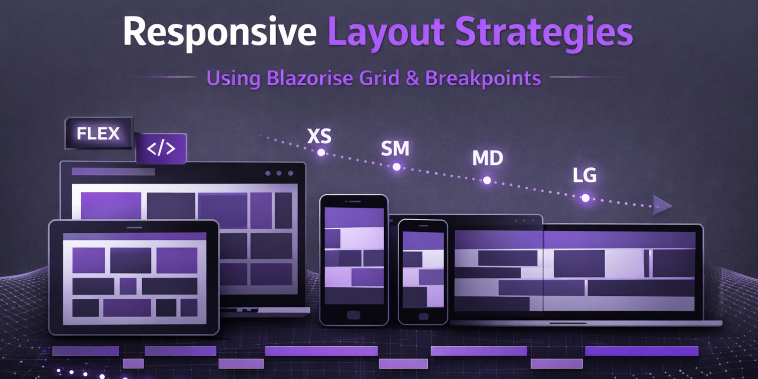
Mobile-First Design with Breakpoint Helpers
Blazorise follows a mobile-first philosophy. Layout definitions should describe the smallest viable experience first, and progressively enhance it as screen size increases.
Breakpoint helpers make this approach explicit. Instead of writing conditional logic or duplicating markup, you express layout evolution declaratively.
<Row>
    <Column ColumnSize="ColumnSize.Is4.OnDesktop.Is6.OnTablet.Is12.OnMobile">
        <Card>
            <CardHeader>
                <CardTitle>Order Summary</CardTitle>
            </CardHeader>
            <CardBody>
                <Paragraph>
                    This column adjusts automatically based on screen size,
                    keeping key order information readable on mobile and desktop.
                </Paragraph>
            </CardBody>
        </Card>
    </Column>

    <Column ColumnSize="ColumnSize.Is8.OnDesktop.Is6.OnTablet.Is12.OnMobile">
        <Card>
            <CardHeader>
                <CardTitle>Customer & Fulfilment</CardTitle>
            </CardHeader>
            <CardBody>
                <Paragraph>
                    Multiple breakpoint sizes can be combined fluently
                    to keep details visible without writing CSS media queries.
                </Paragraph>
            </CardBody>
        </Card>
    </Column>
</Row>
Responsive spacing follows the same pattern:
<Card>
    <CardBody Margin="Margin.Is2.OnMobile.Is5.OnDesktop">
        On smaller screens this content has compact spacing,
        while desktop layouts provide more breathing room.
    </CardBody>
</Card>

<Card Margin="Margin.Is3.FromTop">
    <CardBody Padding="Padding.Is2.OnY.Is4.OnX">
        Extra horizontal padding keeps content readable in wide layouts.
    </CardBody>
</Card>
Common Layout Anti-Patterns and How to Avoid Them
Many layout problems in Blazor applications are not caused by missing features, but by misapplied abstractions.
Using Flex for entire page layouts often leads to unclear structure and fragile behavior. Grid should be used for page-level composition, reserving Flex for local alignment.
Another common issue is duplicating markup for different screen sizes. Breakpoint helpers eliminate the need for this by allowing a single component tree to adapt across devices.
Over-nesting Rows and Columns creates unpredictable behavior. Nesting should reflect real structural hierarchy, not compensate for missing layout decisions.
Finally, excessive mixing of raw CSS utilities with Blazorise parameters leads to conflicting rules. Prefer Blazorise layout parameters whenever possible to keep layout behavior consistent and provider-aware.
Designing Layouts for Change
Responsive layout is not a one-time concern. Requirements evolve, screens diversify, and UI density increases.
Blazorise's layout system is designed to absorb that change. Grid establishes stable structure. Flex handles local alignment. Breakpoint helpers encode responsive intent directly into components.
When these tools are used deliberately, layouts remain readable even as complexity grows.
Final Thoughts
Good responsive design is less about clever tricks and more about restraint.
By separating structure from alignment, embracing mobile-first breakpoints, and avoiding common layout anti-patterns, Blazorise applications gain a layout system that scales with both screen size and application complexity.
The result is UI that feels intentional rather than reactive.
